Redesign of the MBTA (Massachusetts Bay Transit Authority) App
Project Specs
-
Team included: Myself and 2 other Tufts students
My role was: UX research, wireframe mockups, theme generation, usability testing, final prototype
-
Tasked with a hypothetical Full Scale App Development for the Massachusetts Bay Transit Authority (MBTA), our class team was asked to developed a new mobile app, CharlieTM. Charlie will offer travelers a more convenient travel experience with the MBTA and its three main transit options - the subway (commonly known as the T), the commuter rail, and the bus.
-
We had 3 weeks to complete this project. Starting with research, we conducted a focus group to understand more about our target users. The main take aways from our research was that the T serves as a convenient and cheaper option that works with the location of both peoples houses and offices in the city. For the infrequent user, the T was easy to meet with friends in the city or to get dinner. The biggest complaint was that while the T or bus is nice sometimes, it often can be too big of a hassle and time commitment.
Design Features
Though we knew going into this project that we would be creating a mobile ticket system of some kind, we wanted to hear feedback on the idea. Everyone seemed to agree that a mobile ticket would be very useful as it is harder to loose, more environmentally friendly, and much easier to access.
User desired features:
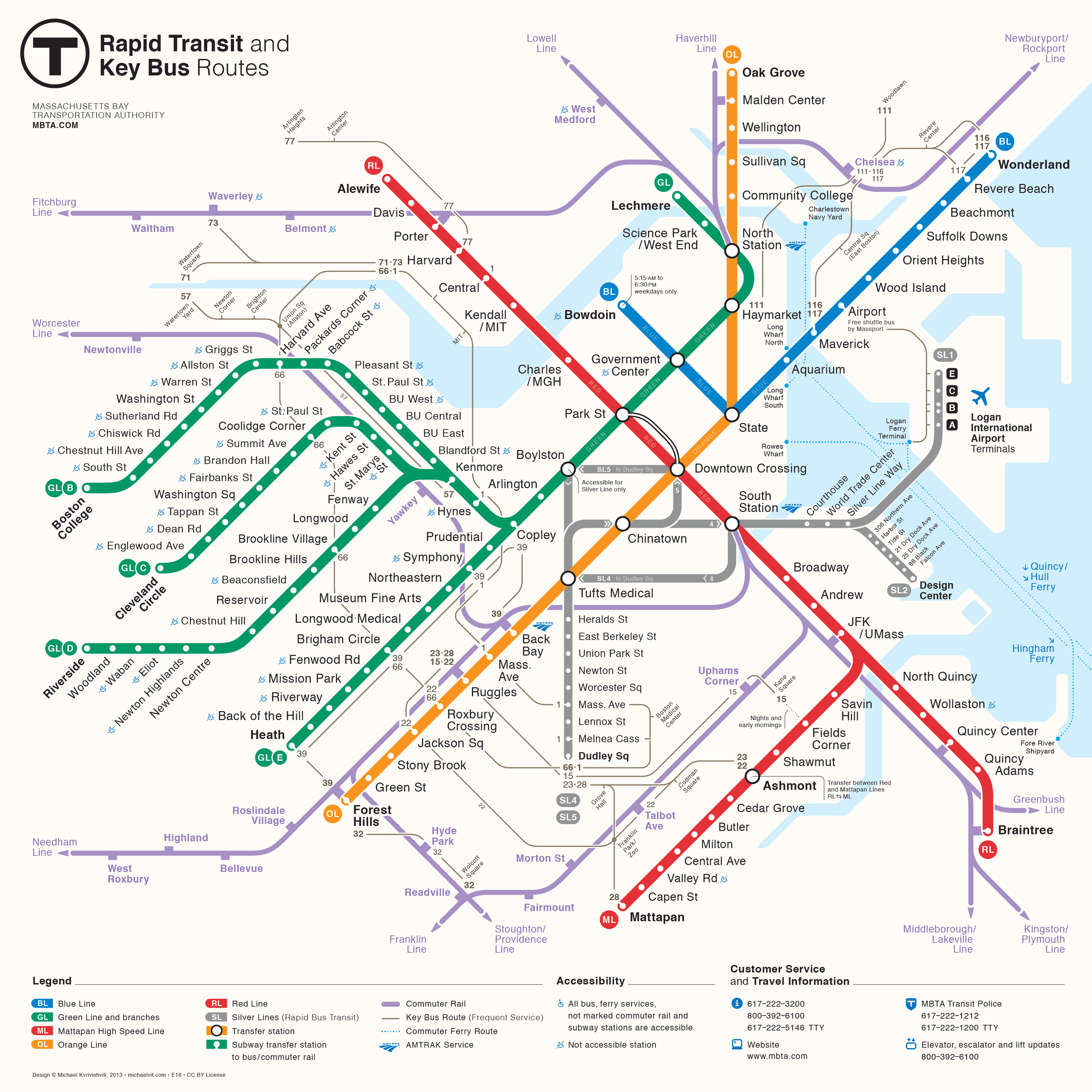
Easy to access map of the subway or commuter rail system
Accessible map so users can play their route or remind themselves of station names
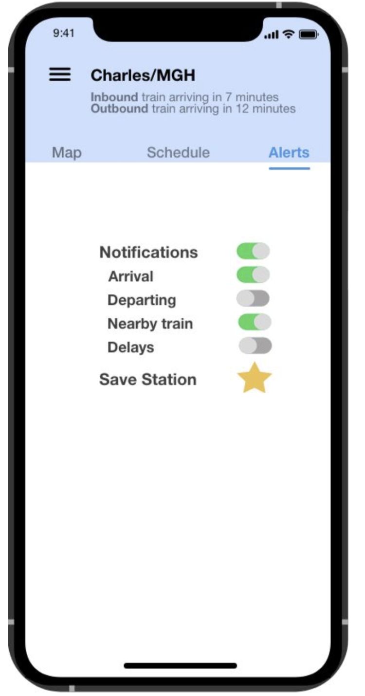
Notifications
Location sharing
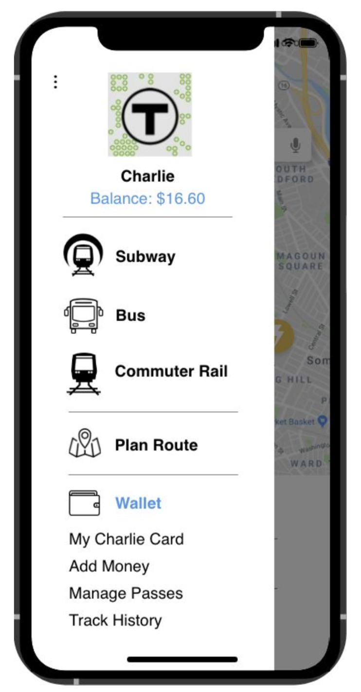
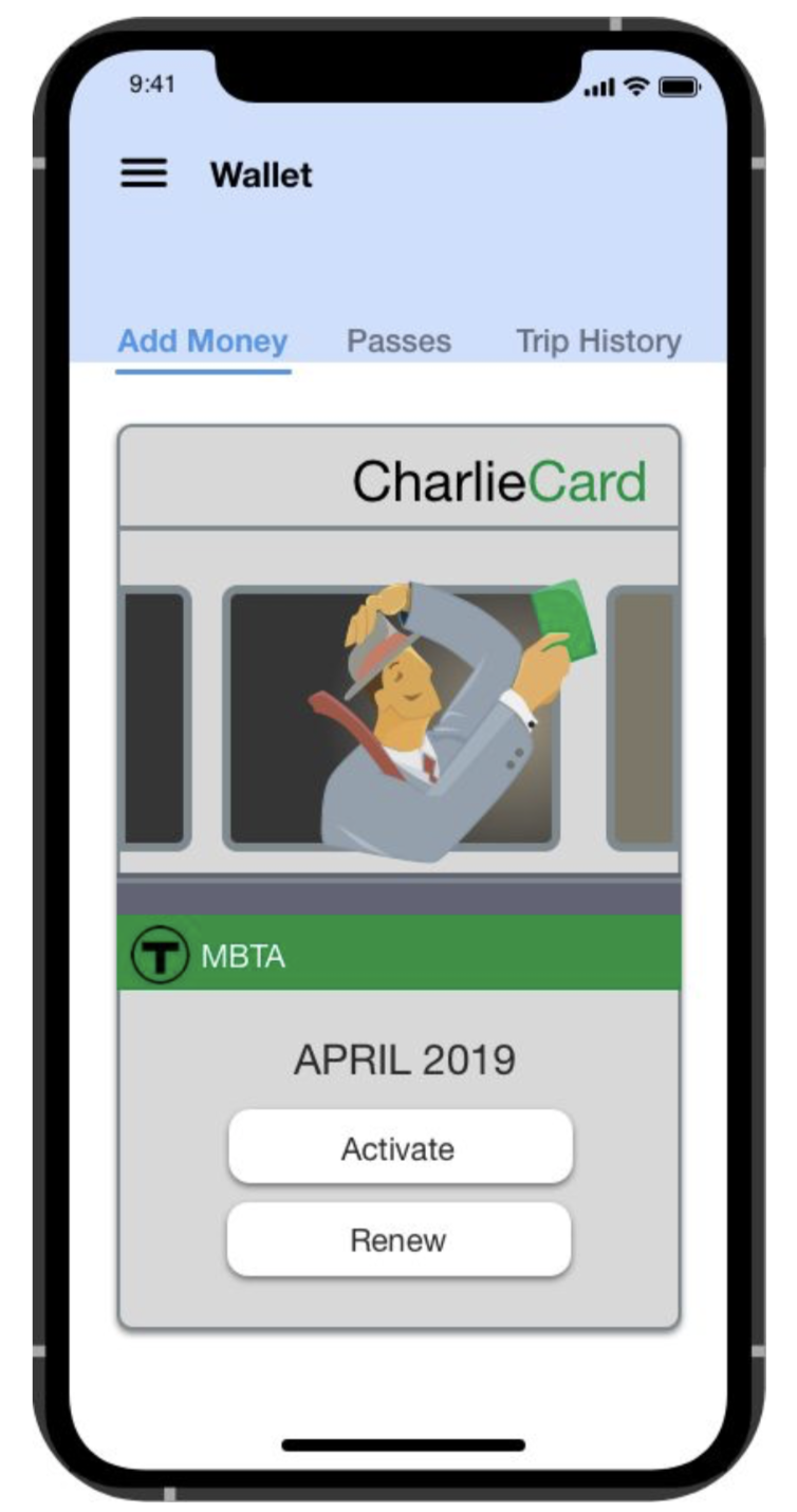
Mobile Charlie Card
Initial Wire Frames and Usability Testing
-
For our next step, we conducted usability tests in an effort to determine the strengths and weaknesses of our MBTA app prototype. We talked to six different people, all in different professions; a couple students, a professor, a cyber security software employee, and a pharmacist. Participants ranged from 21 years old to 55 years old.
We started by asking our users a few questions:
How often do you travel on the MBTA?
Just from looking at our initial screen, what type of info do you think you will get from this app?
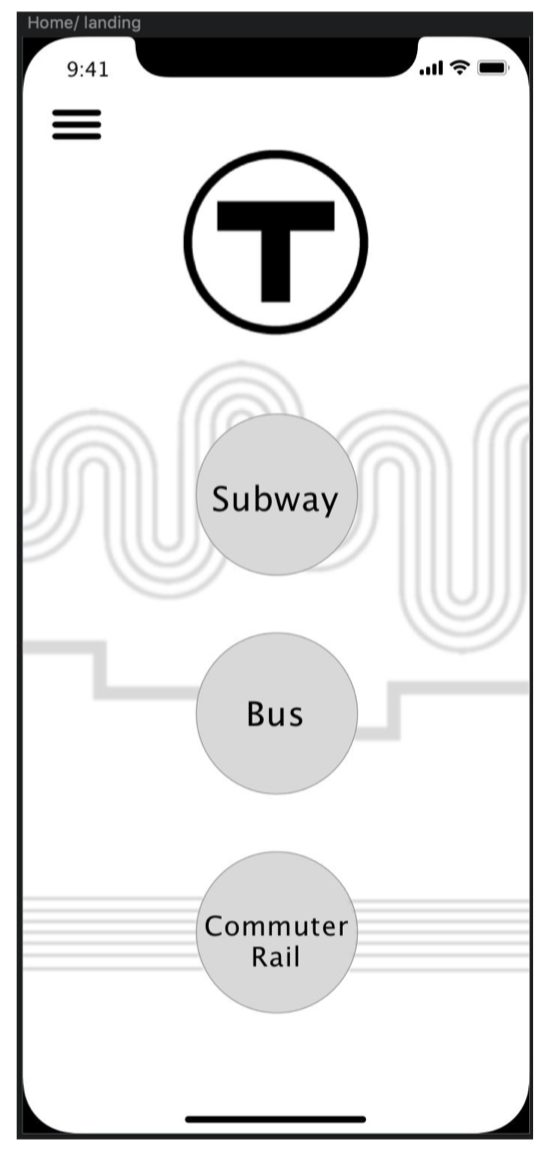
A few of the people we talked with were regular T-users while others were infrequent users. User’s initial impressions of the landing screen were that our app would be able to display scheduling information and provide alerts for the subway, commuter rail, and bus lines. It appeared that although they were only a tap away, some of the apps key features were not available for immediate interaction.
To test our prototype, users used one of our designers' computer with the prototype already pulled up. The first task we instructed users to complete was to view the bus map. A straightforward process requiring only two clicks, users had no trouble distinguishing between the subway, bus, or commuter rail in the hamburger menu and deemed it was clear that you could click on said sections to bring you to a coinciding page.
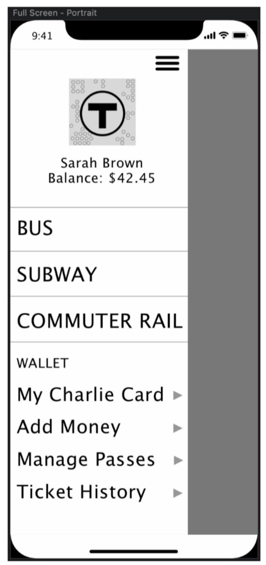
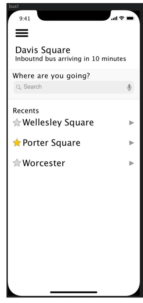
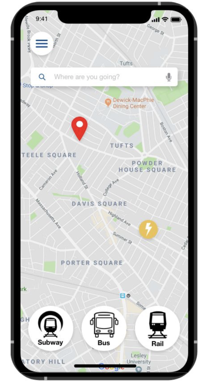
Of those we talked to, two were regular MBTA users. They questioned why our initial screen brought you to three main options; subway, bus, and commuter rail, instead of adapting to the preference or most used form of transportation of the user. An infrequent T-user brought up that they would like the ability to plan a trip or route without being in or near a station or stop. Using this feedback we decided to revise our app’s landing screen. Now, instead of opening to a screen with transportation options, users open to a map. At the top of the map is a search bar to allow the user the ability to search for a desired location and, using a step by step format, our app will direct the user to their destination using the fastest/closest MBTA methods. Further, we decided to include the users most recent destinations or most visited stations at the bottom. This provides the user, often a busy commuter traveling the same route, with a quick shortcut.
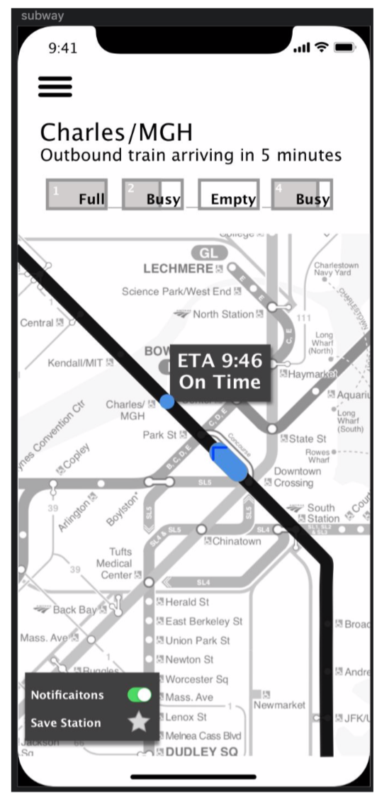
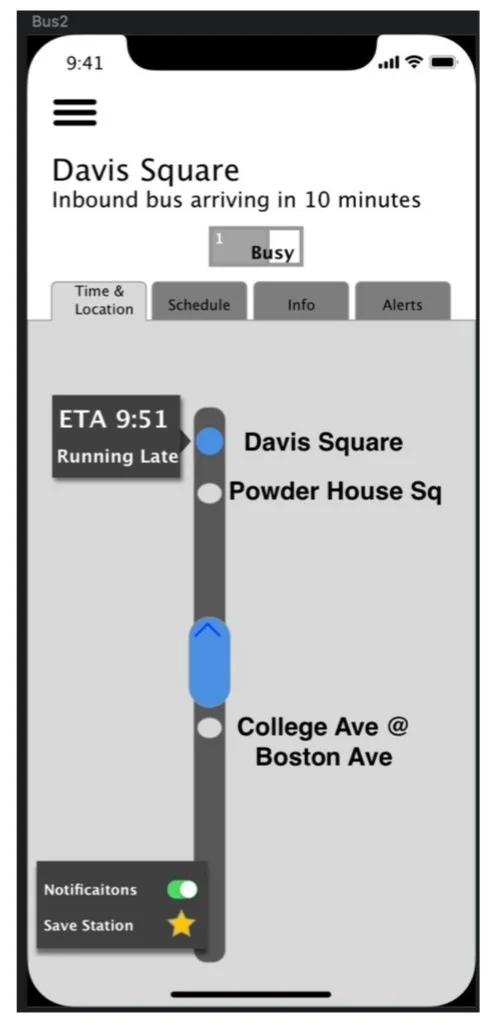
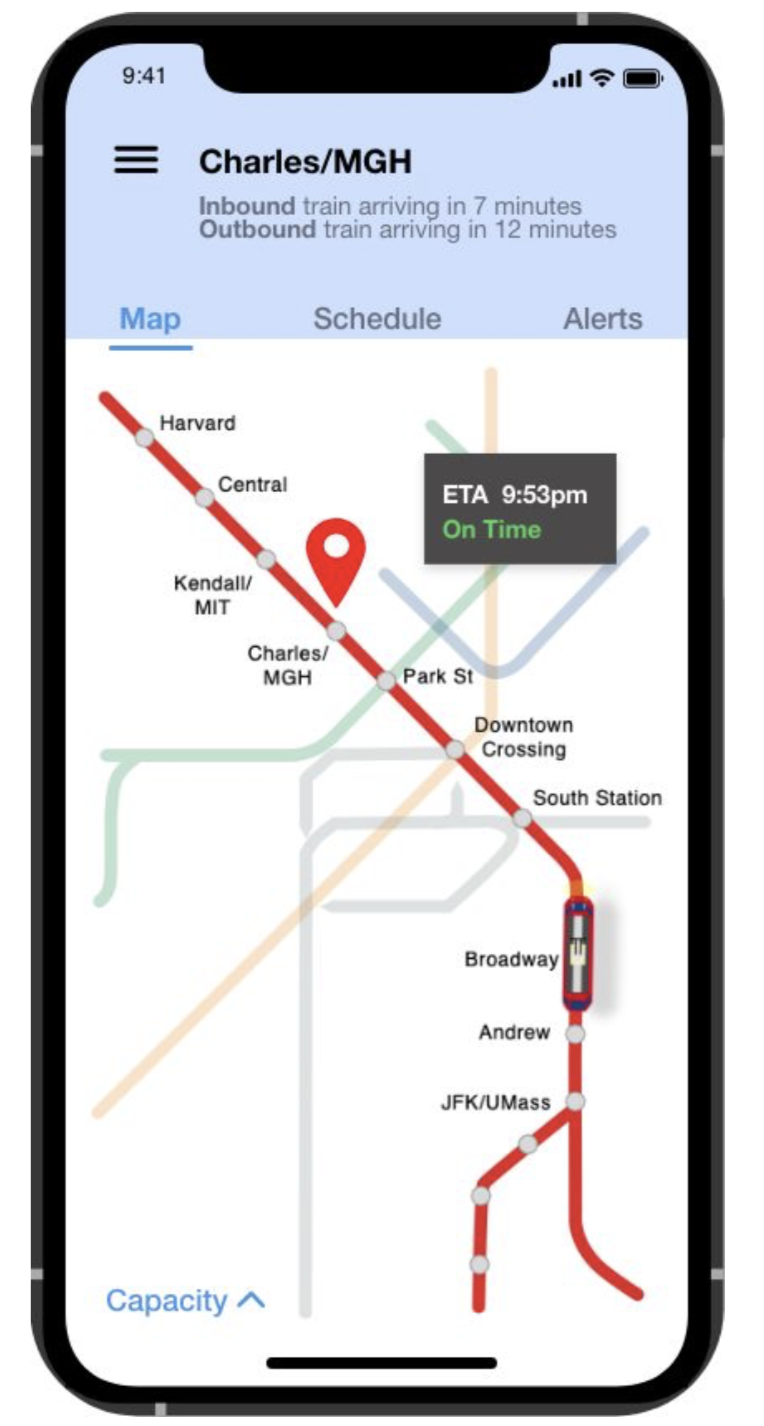
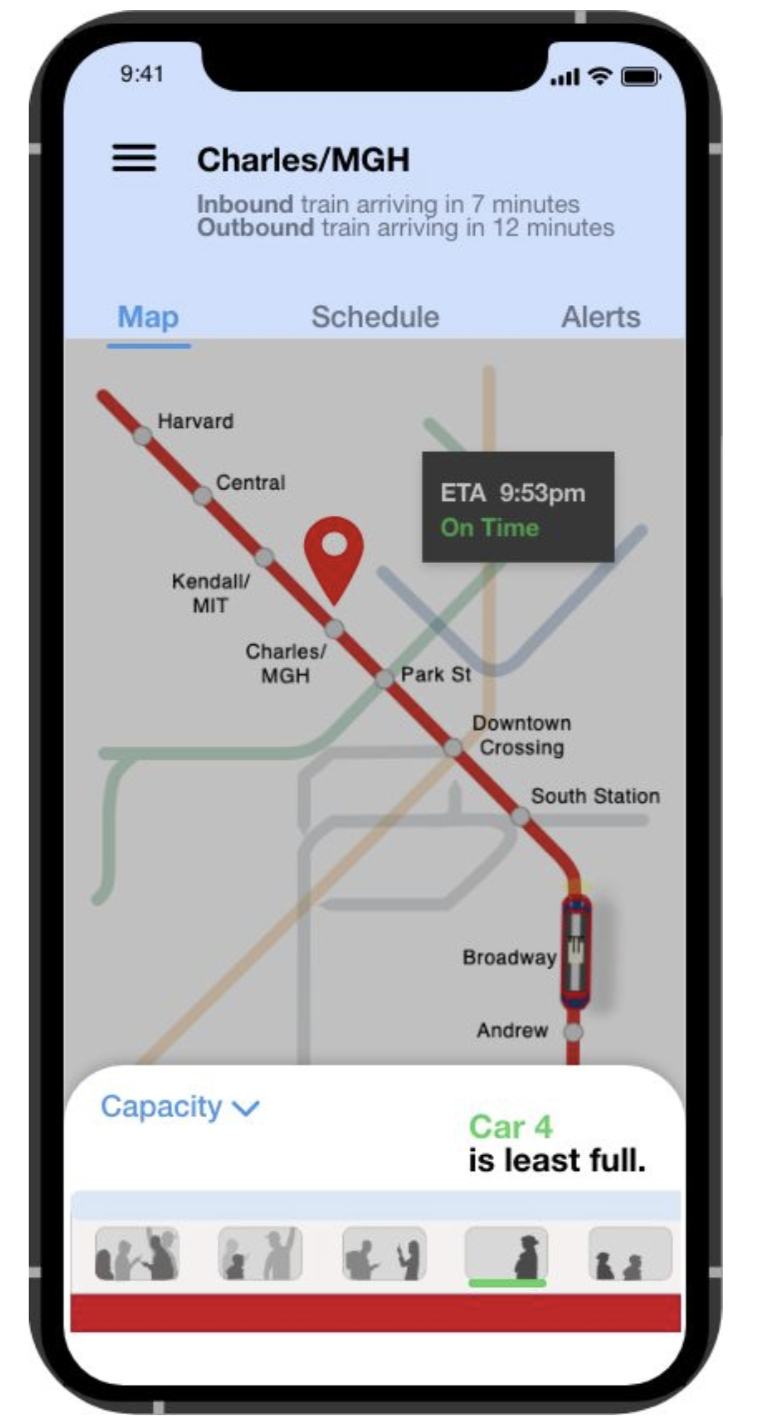
Next, we decided to rework the subway page. Users struggled with understanding what information was given on this page. They wished that there was a pin showing their location or the station in mind as well as where the train is located on the line. An easy fix but something our designers accidentally missed. With this, there was a comment on the look of the train capacity representation. Users felt that it was out of place, and they did not fully understand the information it was displaying. Our designers decided to revamp this to provide a more realistic / more informative graphic that matched the feel of the app. Now, the train capacity illustration displays crowdedness in the same way that people gauge it normally: by looking at the people through the windows. Without confusing color gradients or box heights, the illustration now provides a symbolic side view of the train and where it is crowded before the train pulls into the station. To further clarify this information, the feature will give the user information such as “More space in rear.”
In an effort to make our design unique, our designers initially choose a dark maroon accent color for tabs and other highlights within the app. After some feedback and careful consideration, we decided to switch our color to a dark blue. While this change was more pleasing aesthetically, our designers also wanted users to feel like they could trust our app when they add money to their accounts and navigate the city. Especially for people who don’t use the T-often, we want their travel experience to be easy and safe. Blue evokes all of these emotions. Additionally, while we originally hesitated to use a color that had a designated subway line, blue seems like the most appropriate because it is by far the least traveled line.
Finally, we ended with a few closing questions: What is your overall impression of the app? What is your favorite feature/function? Least favorite? Is there anything you feel like is missing? From these questions, we came to the conclusion that our app is on the right path, but seems a bit incomplete. There are a few important concepts (such as being able to plan a route ahead of time) that are missing and would make the experience much better. Users loved the ability to see how far away trains/ buses were and their ETA but were a bit confused whether or not you had to be in the geolocation of the station to view this or could search a specific station/stop.
Mood-boards
This mood-board depicts a colorful approach for the MBTA transportation app. Boston's T already features plenty of color with the Red, Orange, Green, and Blue lines, and this theme highlights this. The primary colors of the theme would be white, with accenting green orange, blue, and green. It would also feature modern illustrations that would make the users feel like they are using an app that was carefully and beautifully designed for them rather than just another bland transit app. The font for this theme is PT Sans Caption - simple, yet matches the modern design - heavy theme.
For this theme, we took a more monochromatic approach. Sticking with black, white, and dark blue, this allows for accent colors to show. This development concept is little different from the currently colorful designs and feel of the MBTA. Though different, this design leans towards a more sophisticated feel though fun icons and clean lines.
We decided to move forward with this mood-board because it allowed us to use the specific train line colors as accents within the app
Final Mockups & Prototype
Click here to see the high fidelity, clickable prototype.