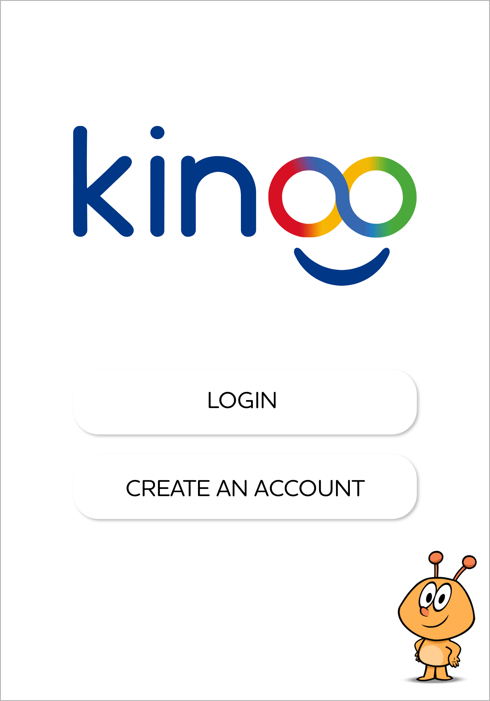
Kinoo
Onboarding and First Time User Experience
Set the Stage
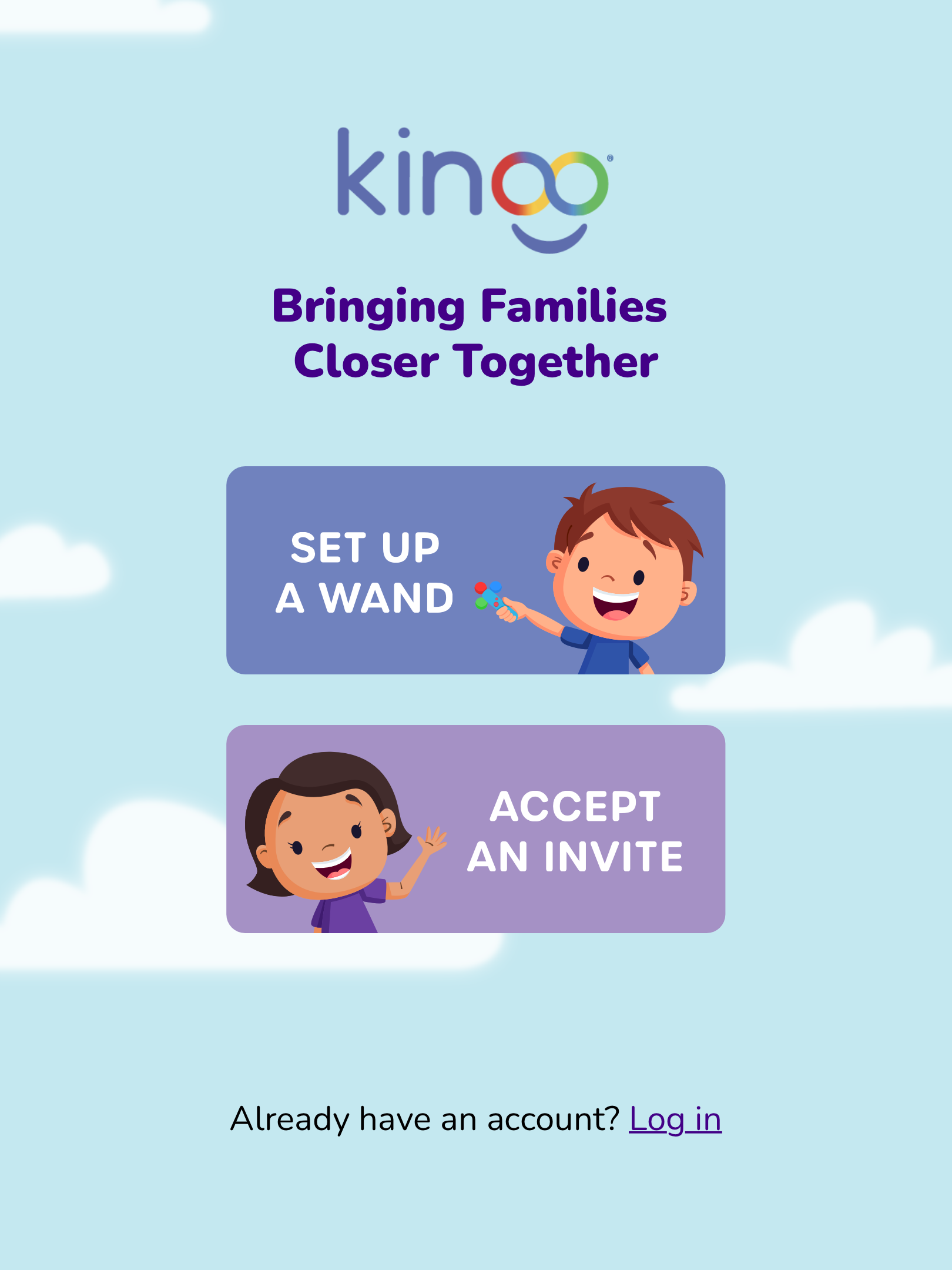
Kinoo is an interactive co-play video chat platform with a mission to create the best possible future for children, their families, and the world through connection, play, and learning. Kinoo launched in Winter 2021 with the Kinoo Connect app focusing on children 3-7 years old, grandparents, and other older loved ones. Along with the app, we also launched the Kinoo Wand introducing another layer of magic and AR within the app, along with encouraging physical movement and engagement during a call.
One of the most crucial moments is the first interaction a user has with an app. This “handshake” moment sets the stage for their initial impressions, how likely they are to recommend it to others, and long term user retention and engagement.
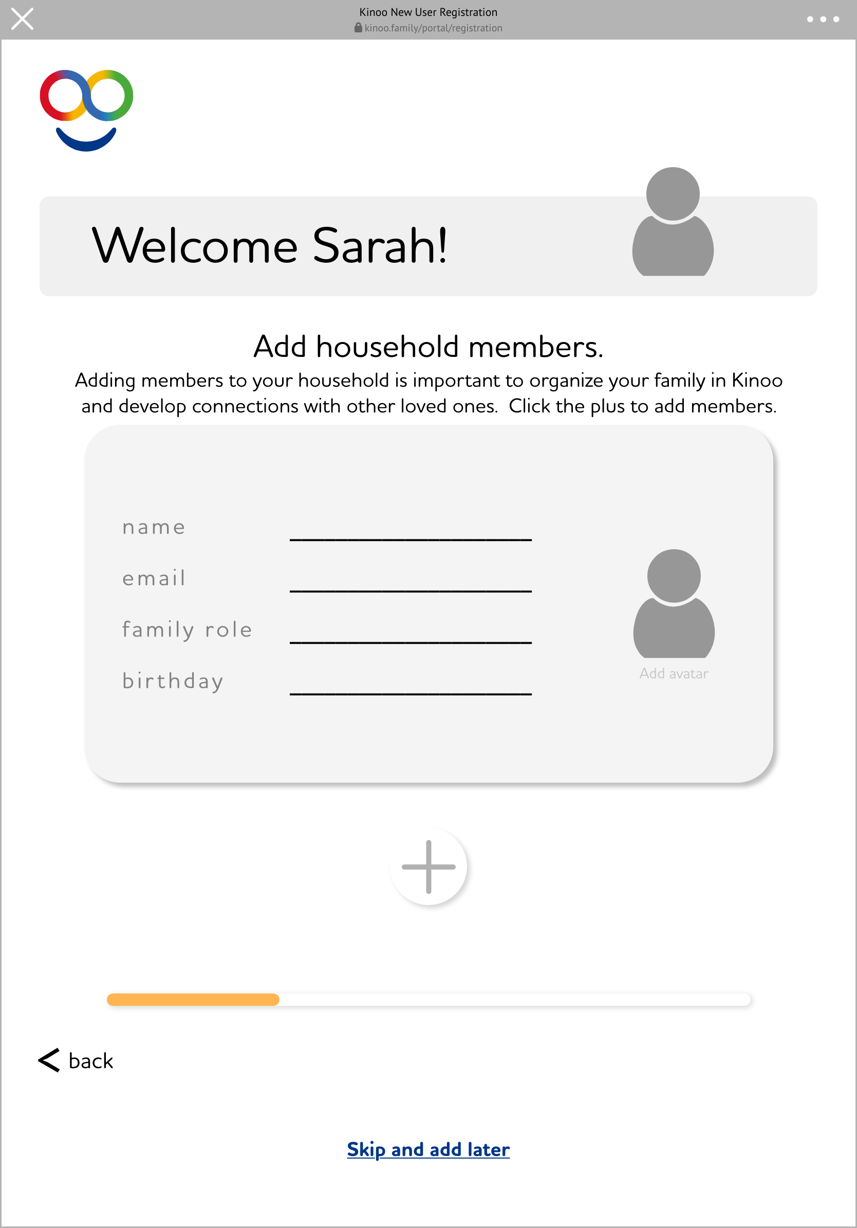
Problem to Solve
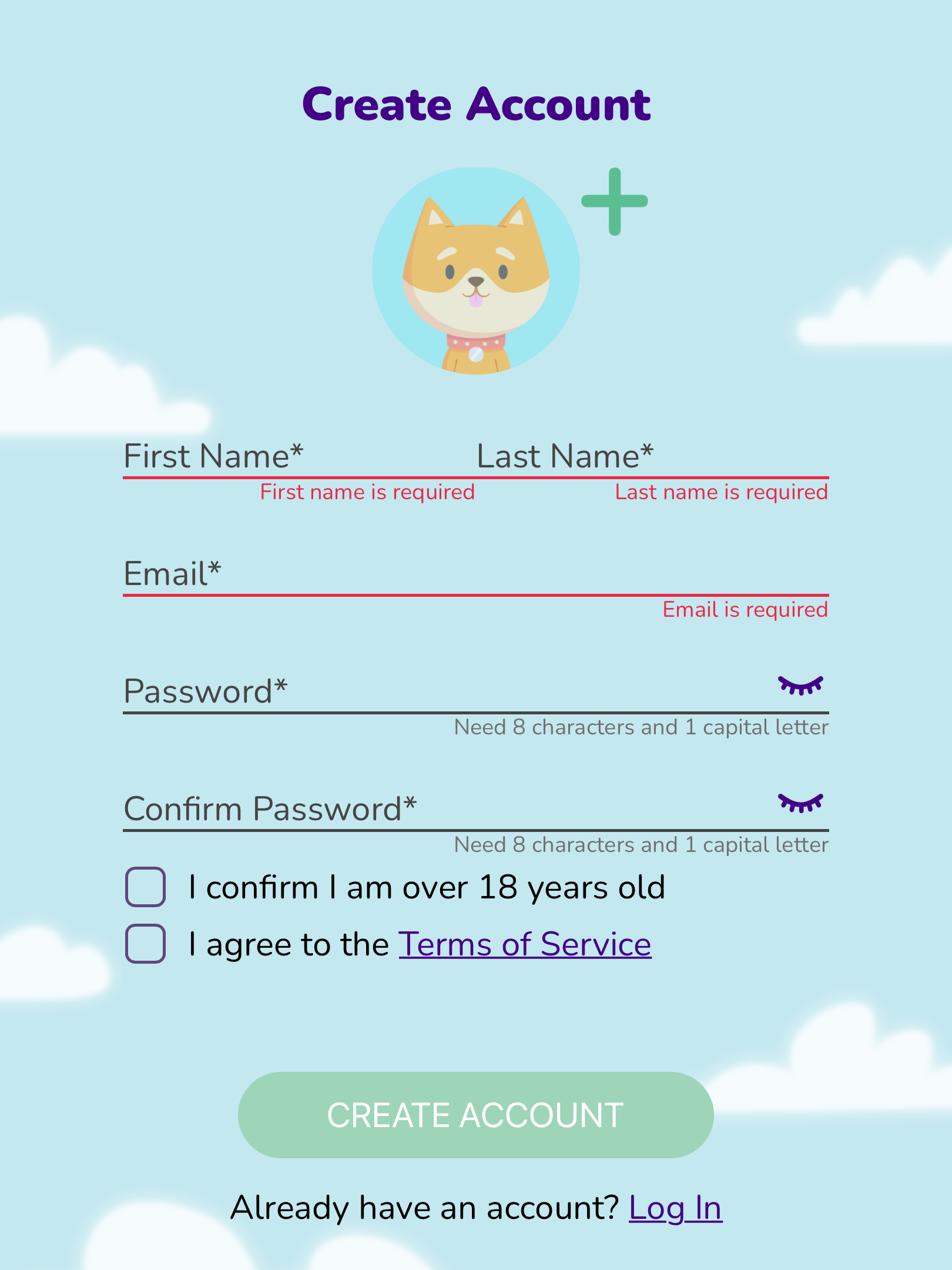
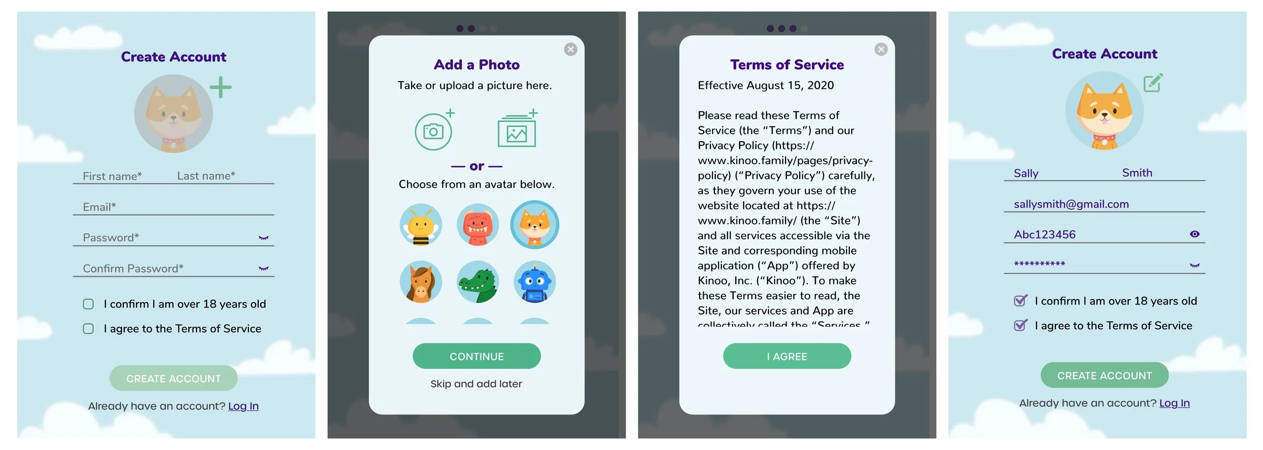
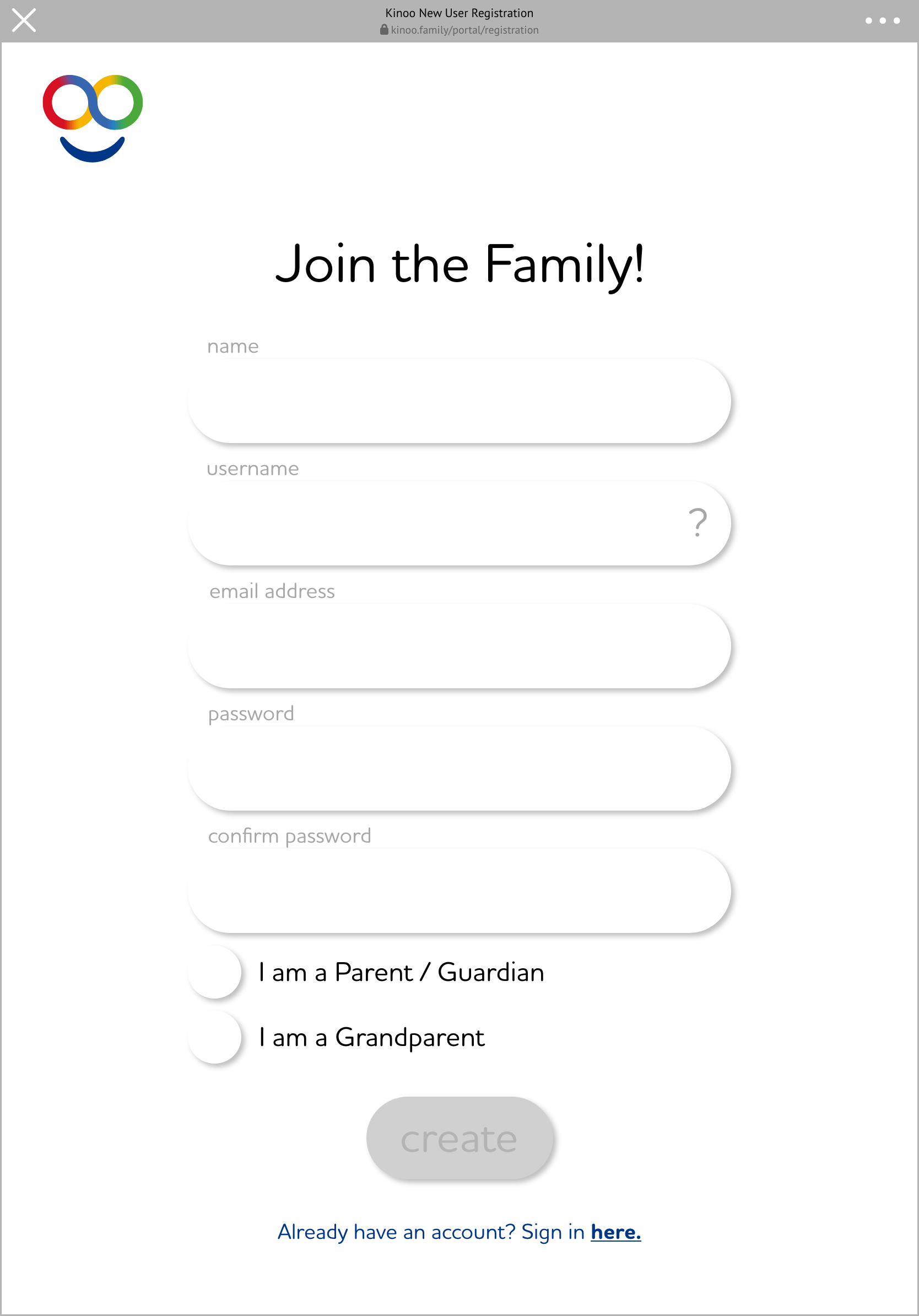
Create a simple and easy onboarding flow for our users (intended for parents and grandparents) while simultaneously capturing all of the necessary information needed for account creation. As many of our users were older adults lacking confidence in their technical abilities, we introduced the elements on our home screen interface, resulting in increased confidence of our users.
My Role
As the first and only UX designer for my first 9 months at Kinoo, I led and owned this onboarding project. Engaging with a part-time contractor now and again, I completed this project with guidance from the Chief Experience Officer and support from our front-end and back-end developers, as well as the UX research team.
Logic

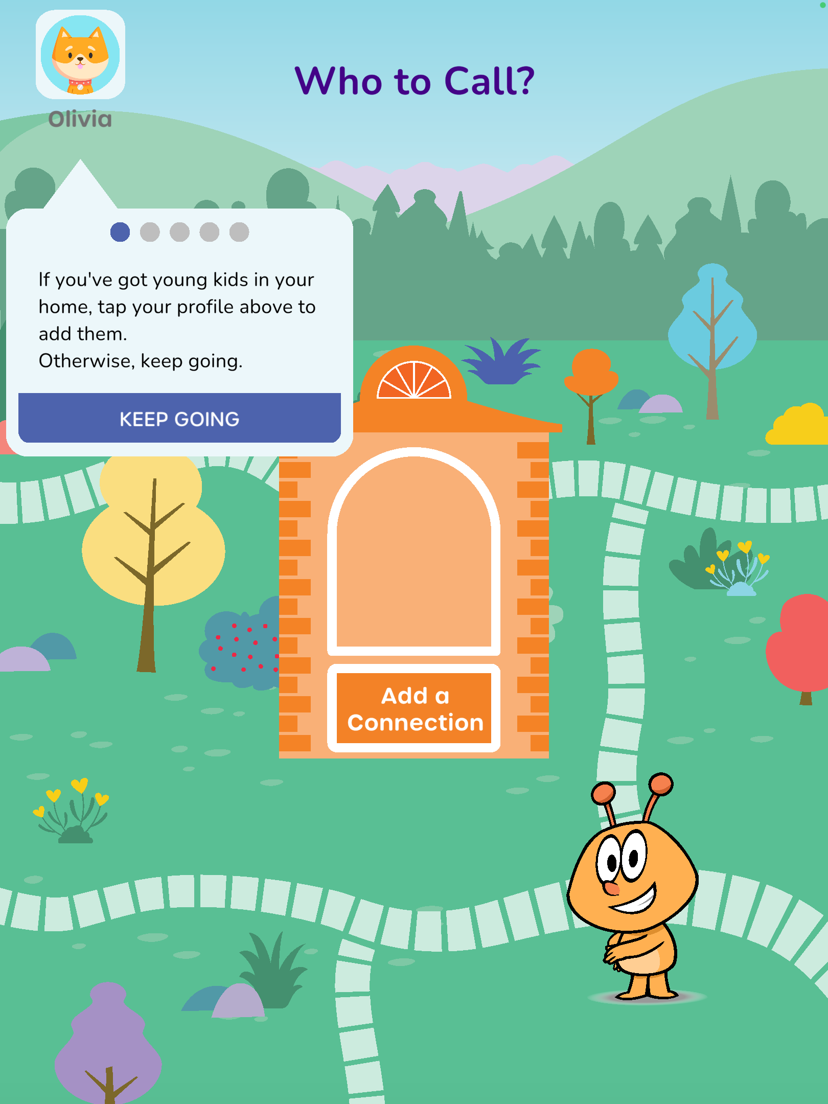
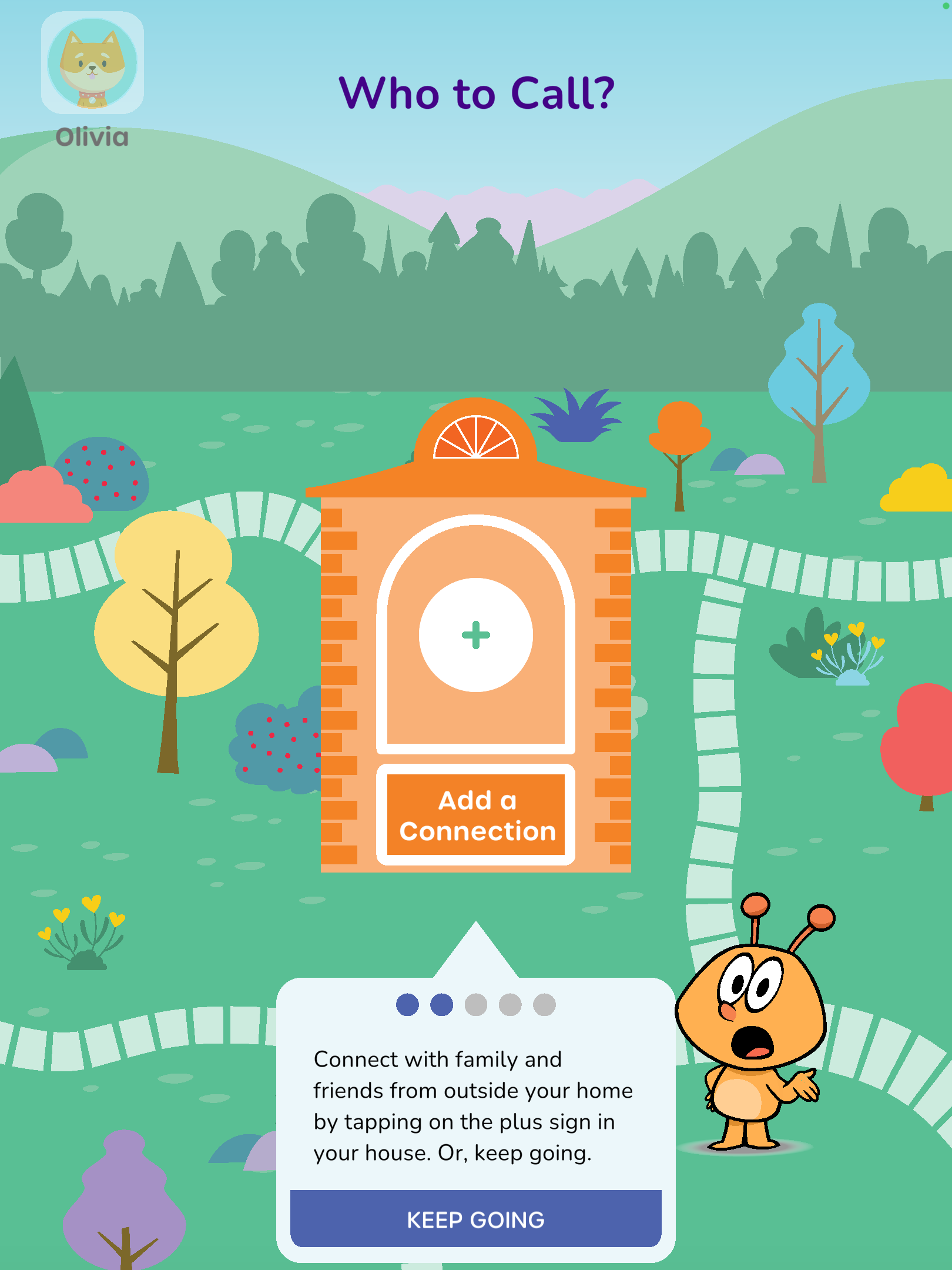
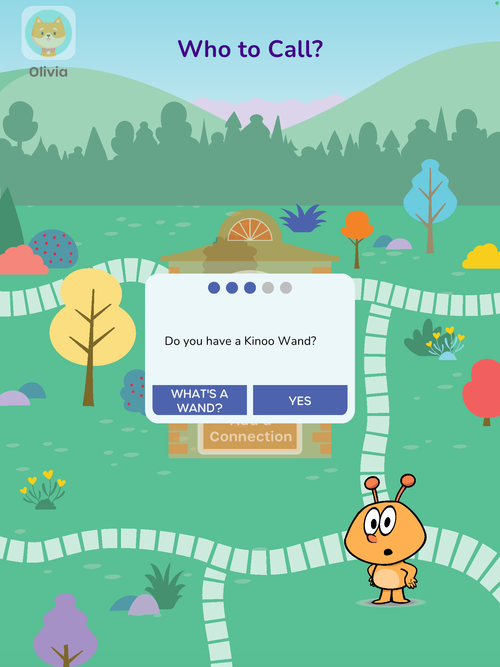
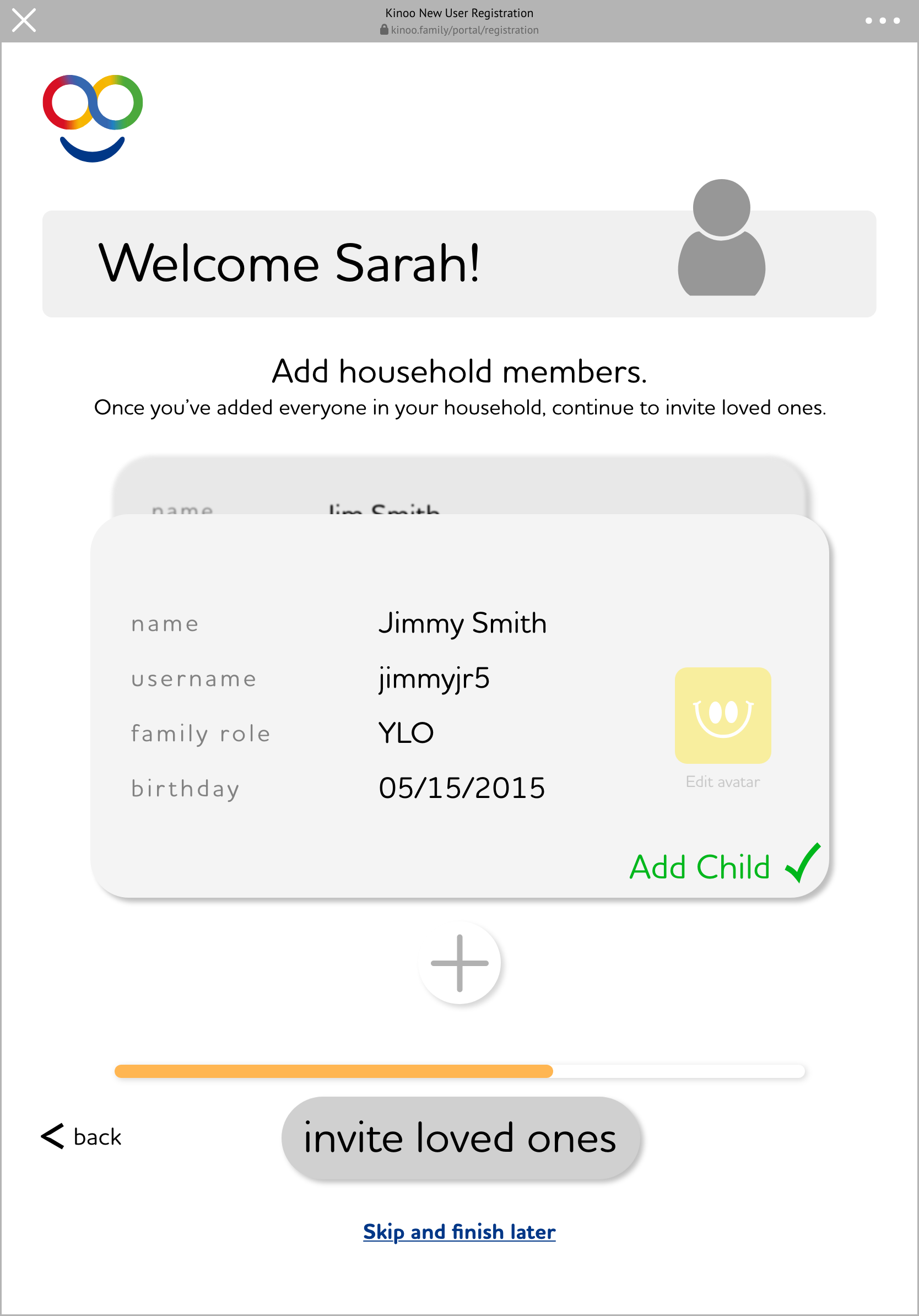
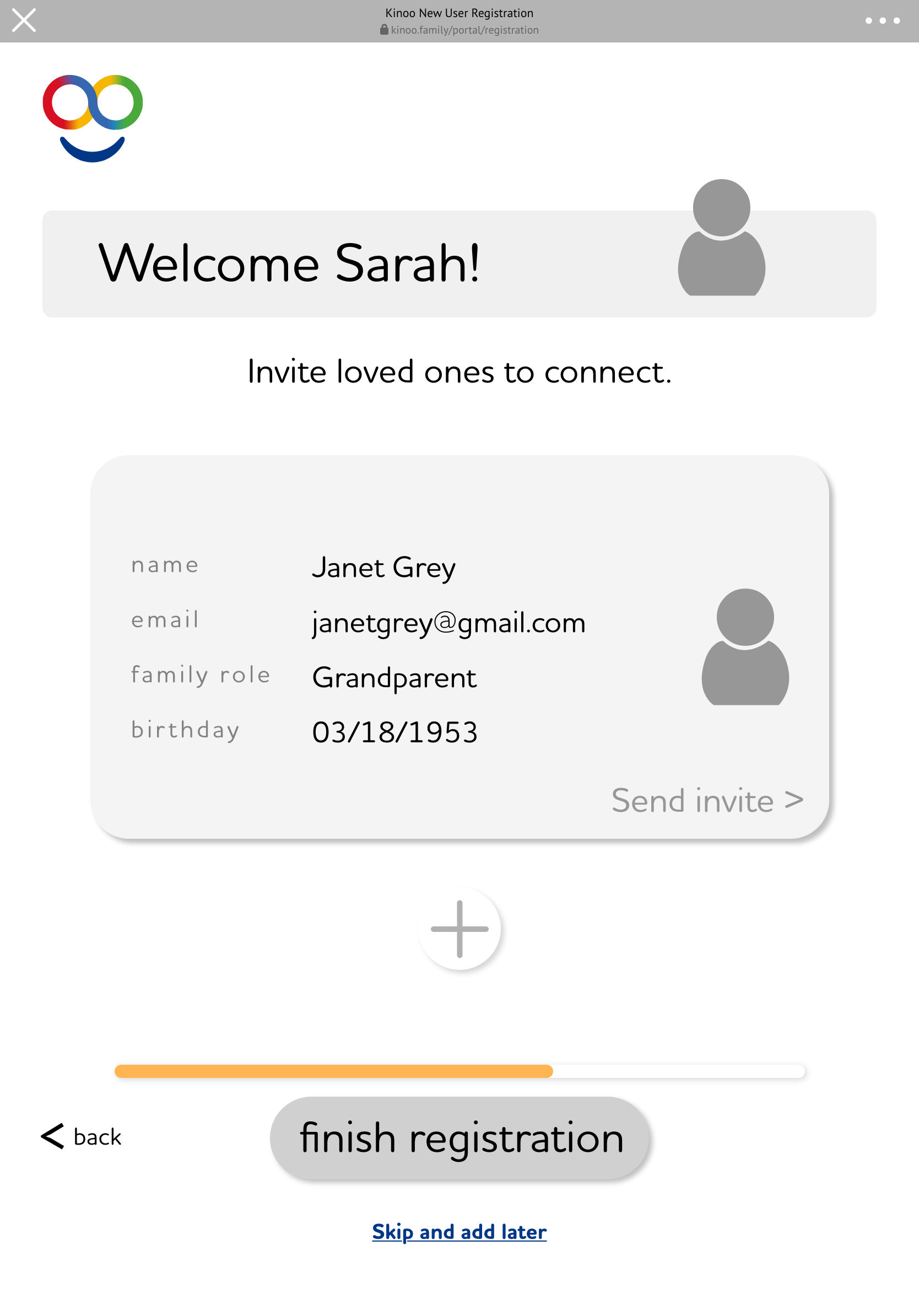
Defining the logic for onboarding was key to catching edge cases. We decided to sacrifice an easy two step onboarding process and instead added in a railroaded tool-tip walkthrough as a requirement to complete onboarding. This was added in as an onboarding requirement based on initial data, research, and conversations where we learned that older loved ones (65+) were reluctant to tap and explore our interface as they were worried they might break the app. By individually introducing each element of the screen, our older loved ones felt less stress and were more open to exploring. This resulted in higher engagement and enjoyment of our older users.
Rough Mockups
Design Considerations
Due to Stakeholder wants, we kept a single user journey for for both parents and for grandparents even though we wanted different information from each. Using our tool-tip walkthrough and very specific language, we guided both parents and grandparents through the experience and looking at our BI data, we successfully got the majority of our users through with the needed information.
Every step of the walk-through is accompanied by Kodii voice over (our AI character) talking users through the experience. We included this for ease of use and accessibility of understanding the information on the screen.
As the user progresses through the experience, each element on the screen is introduced and then faded out to keep users on the right track. Additionally, if a user was to close the app in the middle of the walk-through, upon their next time launching the app we guide them back to the point where the left off.